Sellotape
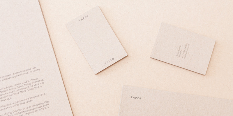
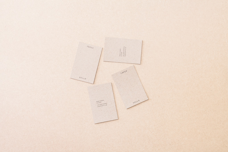
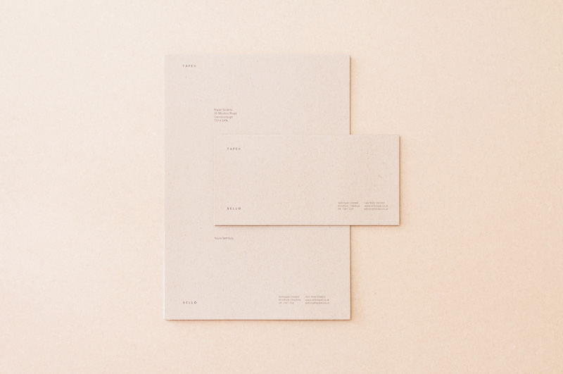
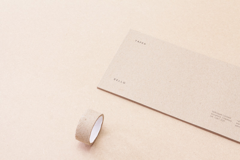
Rebrand of adhesive tape manufacturer Sellotape.Sellotape is a brand name with such popularity that it is used in common speech. The rebrand utilises this, along with Sellotape’s main use to join things together, with the branding needing to be physically rolled for the logo to connect. The material used is identical to that used in Sellotape’s inner ring.

ISTD
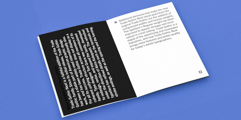
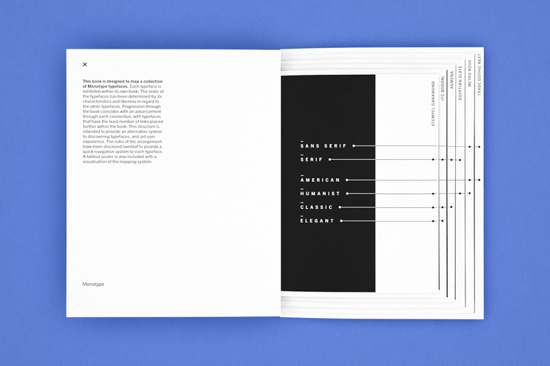
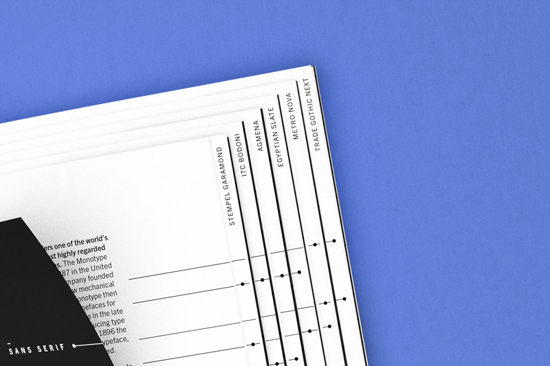
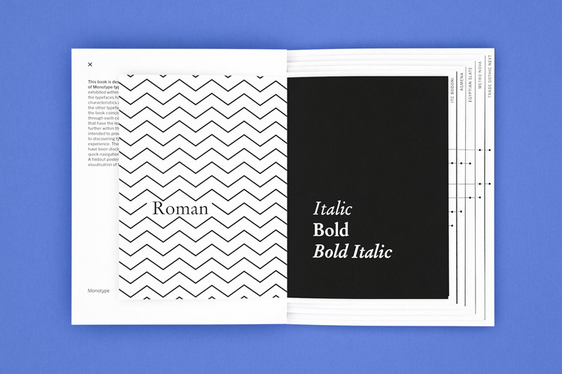
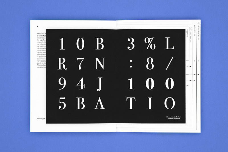
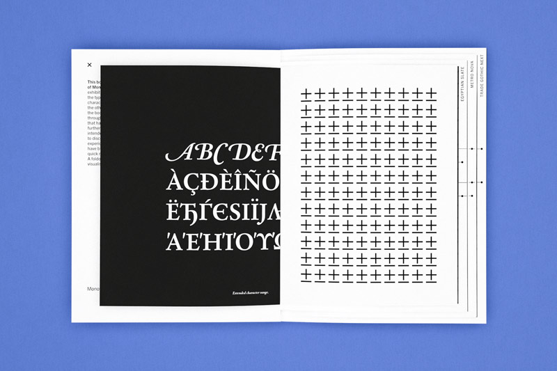
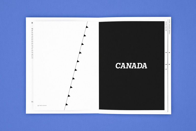
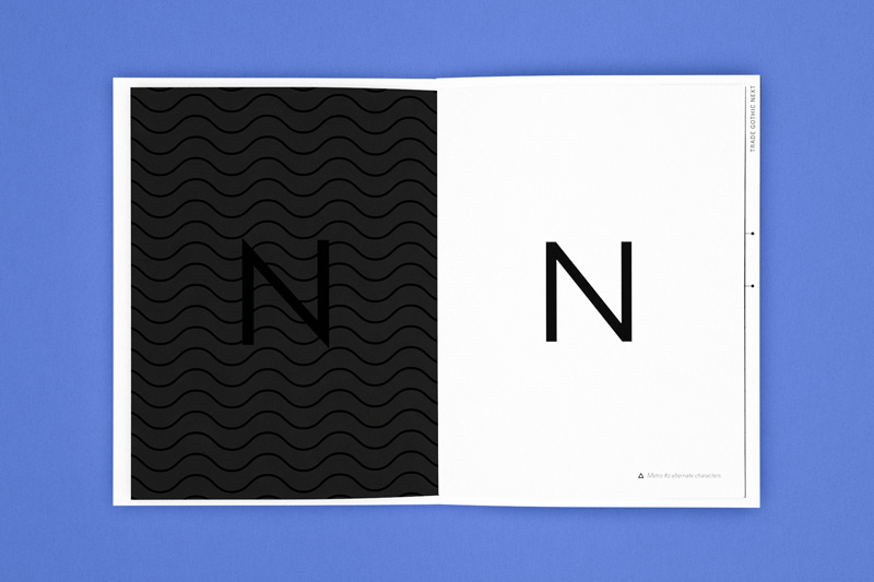
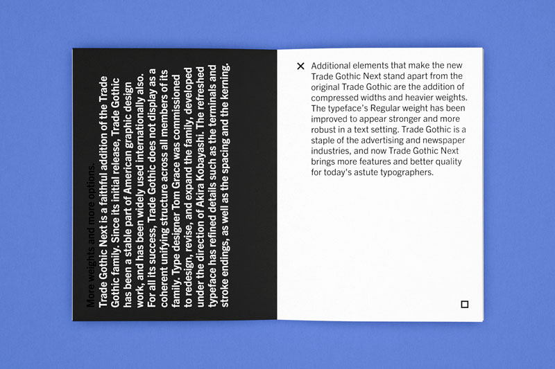
Experimental book designed to map a collection of typefaces.The book provides an alternative type specimen for Monotype by using a linear based approach to showcase the typefaces, much like a conventional narrative structure. Each typeface is placed within its own section. The order of the typefaces has been determined by its characteristics and similarities with regard to the other typefaces. Progression through the book coincides with an advance through each link and typeface, with the similarity between typefaces decreasing further within. The visual style takes reference from mapping symbols and charts and uses these to interact with the typography.
Lines
A short film about journeys and culture. Music by ↪ Joel and Adriel Brandt.Music
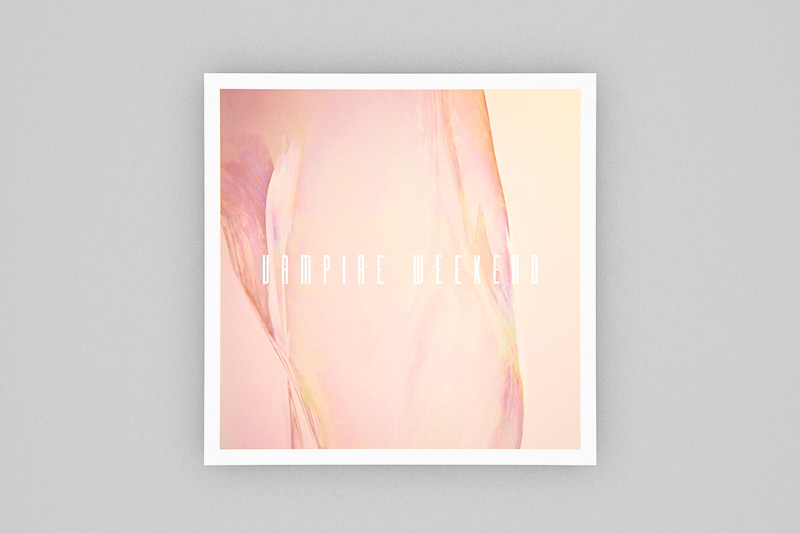
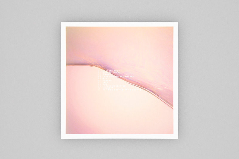
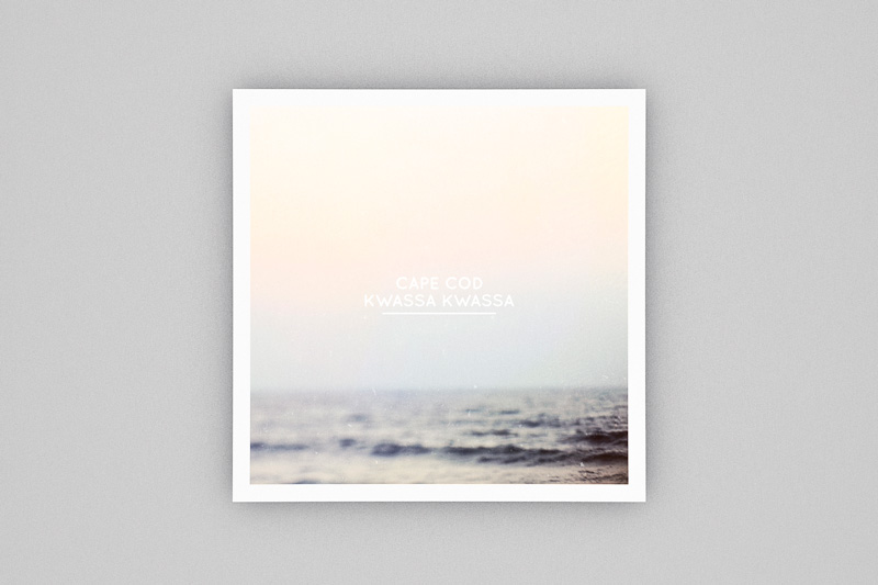
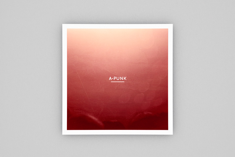
Record cover redesign based on the interpretation of the music.The brief was to redesign the record cover for Vampire Weekend’s self-titled debut album, based on a personal interpretation of the music. The cover is inspired by the eclectic, upbeat, and pop nature of the album, which is visualised through colour. The final result is a 12-inch vinyl record cover, complete with designs for inner sleeves created for the singles on the album. Featured on This & That Collective, digitally and in print.
